Summary
We needed a scalable, reusable design system to unify the experience across multiple features and teams while accelerating product velocity.
The Problem
- Inconsistent UI patterns and visual styles across the product.
- Design debt was increasing as teams scaled.
- Engineers re-implemented the same components with variations.
- Slowed down design and development cycles.
Goals
- Unify UI/UX across modules to build brand consistency.
- Improve designer-developer collaboration.
- Create reusable, accessible, and scalable components.
- Reduce design + dev cycle time by at least 30%.
Discovery & Audit
- Conducted UI audit of 8 key modules: dashboards, workflows, reports, settings, etc.
- Identified 40+ inconsistent components (buttons, modals, inputs, etc.)
- Surveyed designers & devs for pain points with current handoff workflows.
- Benchmarked mature systems (e.g. Polaris by Shopify, Atlassian DS, Material UI).
System Architecture
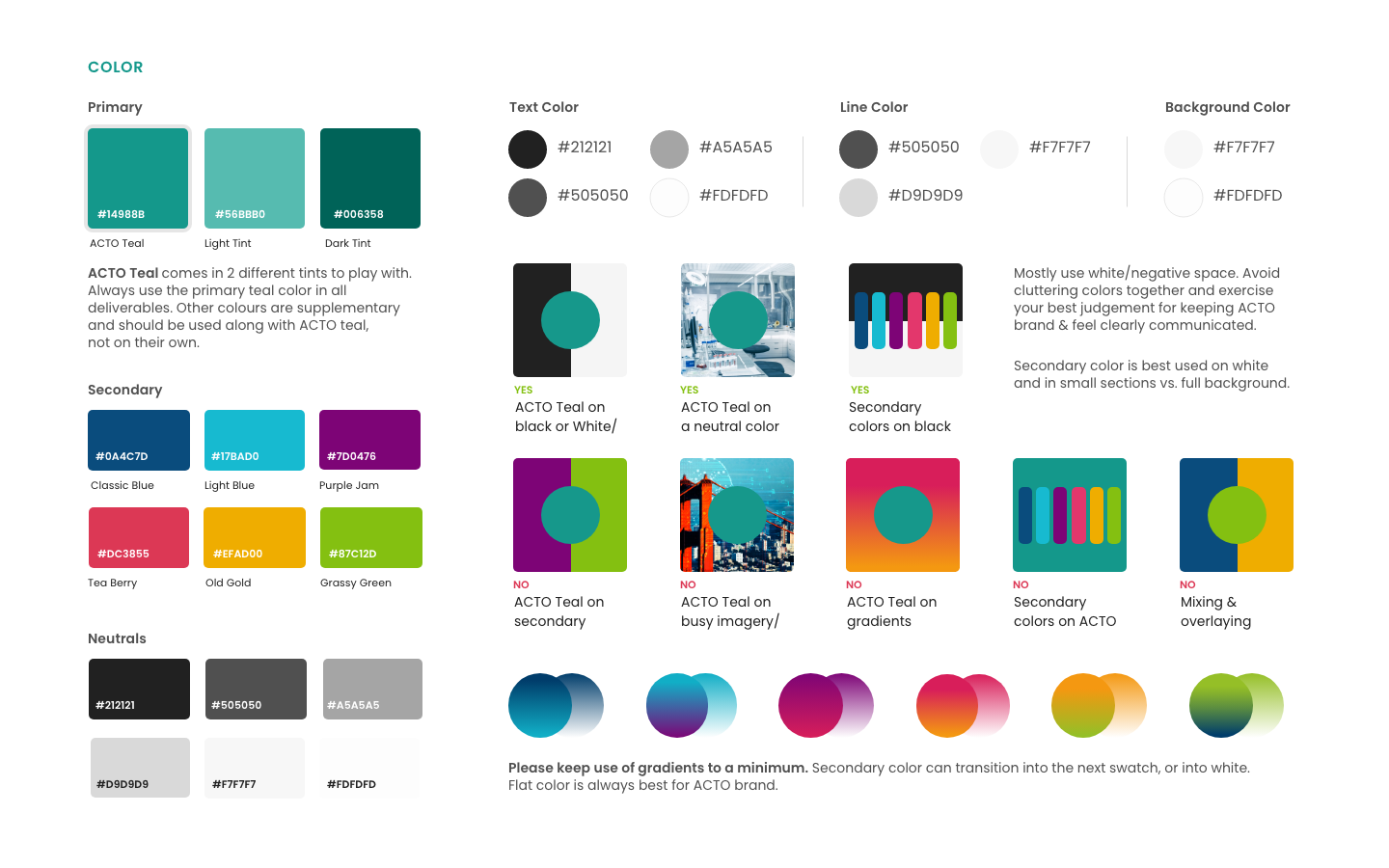
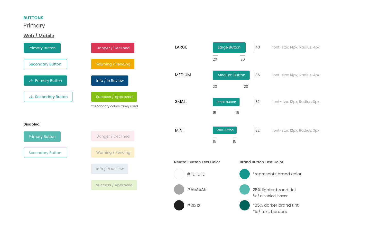
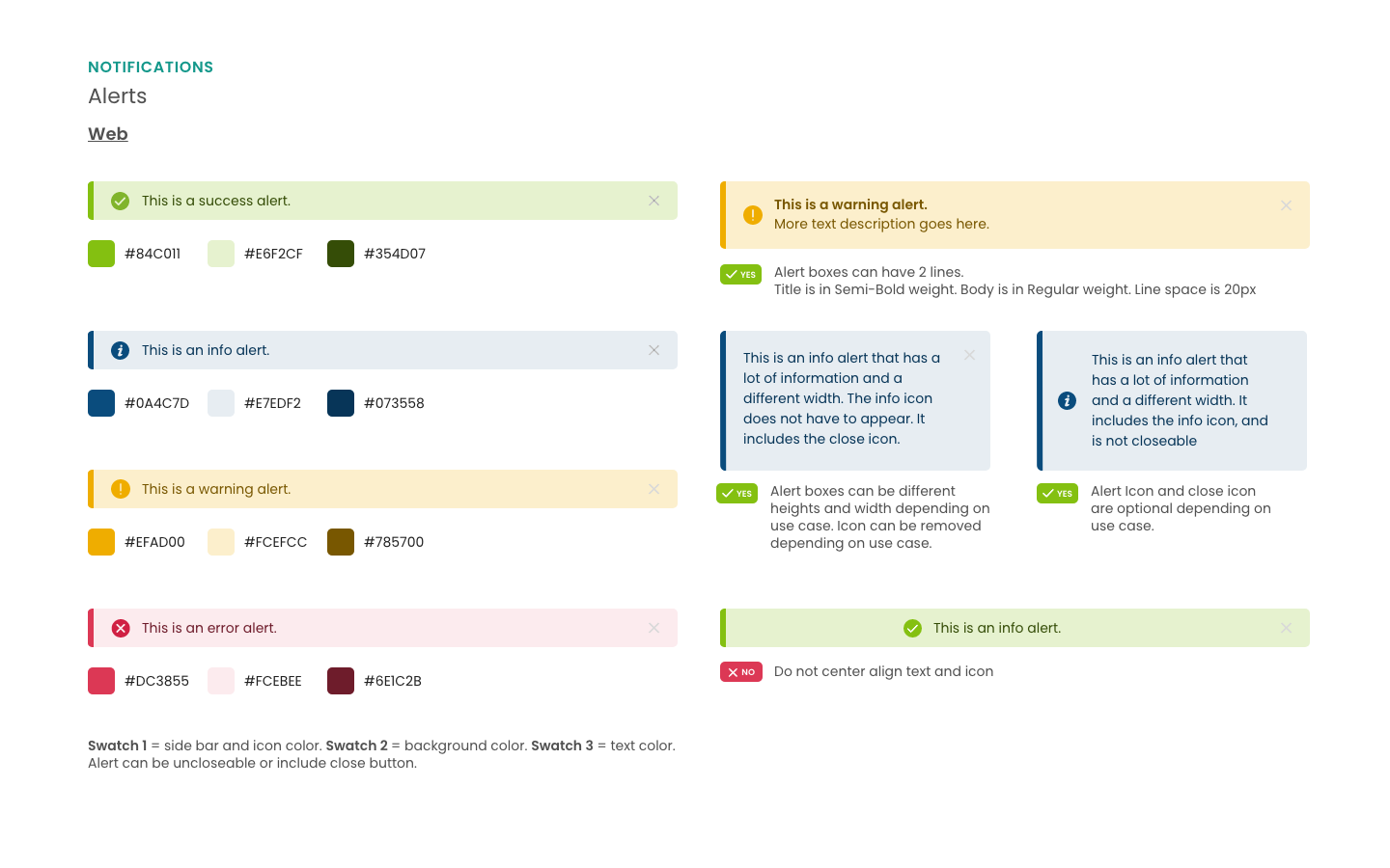
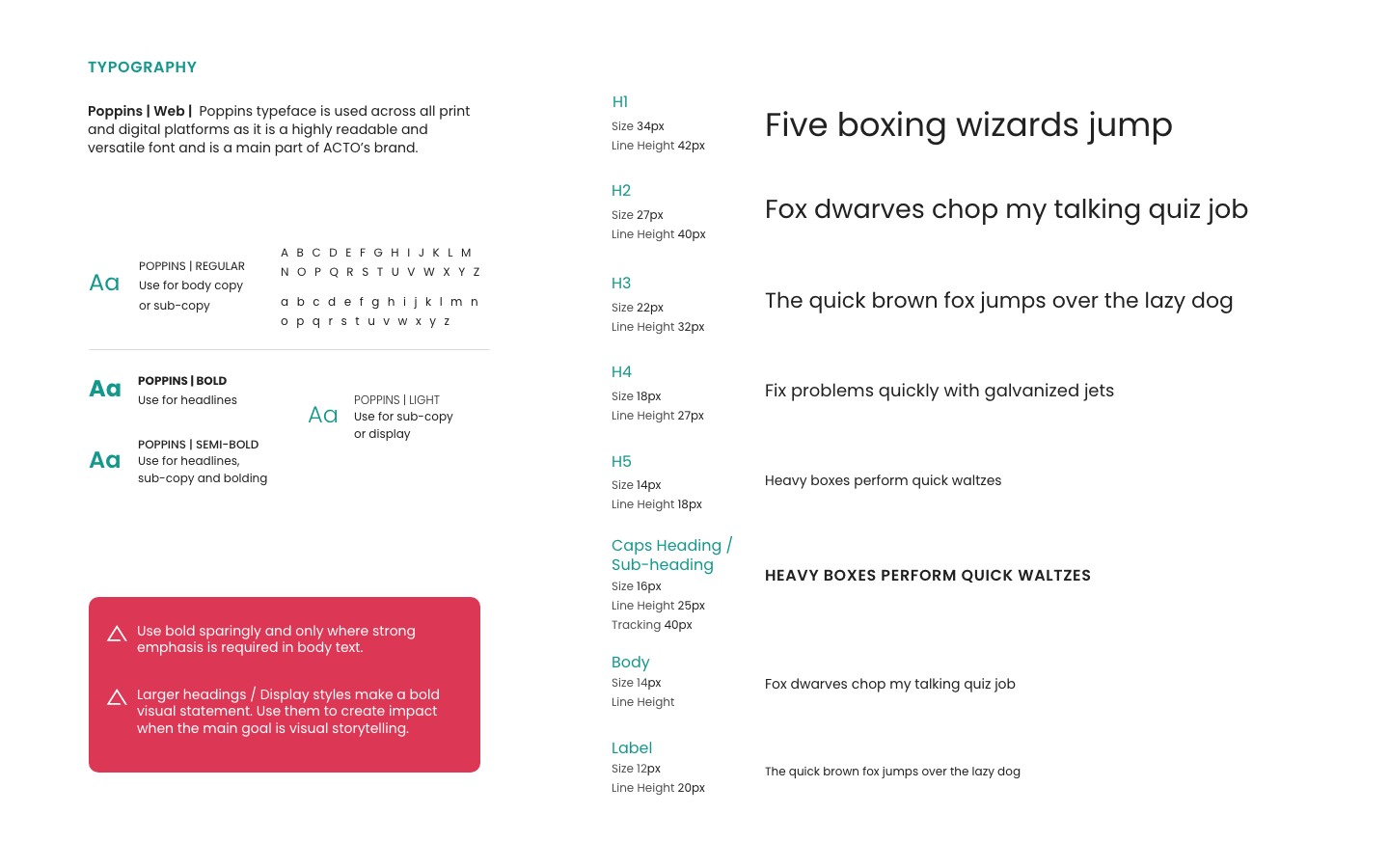
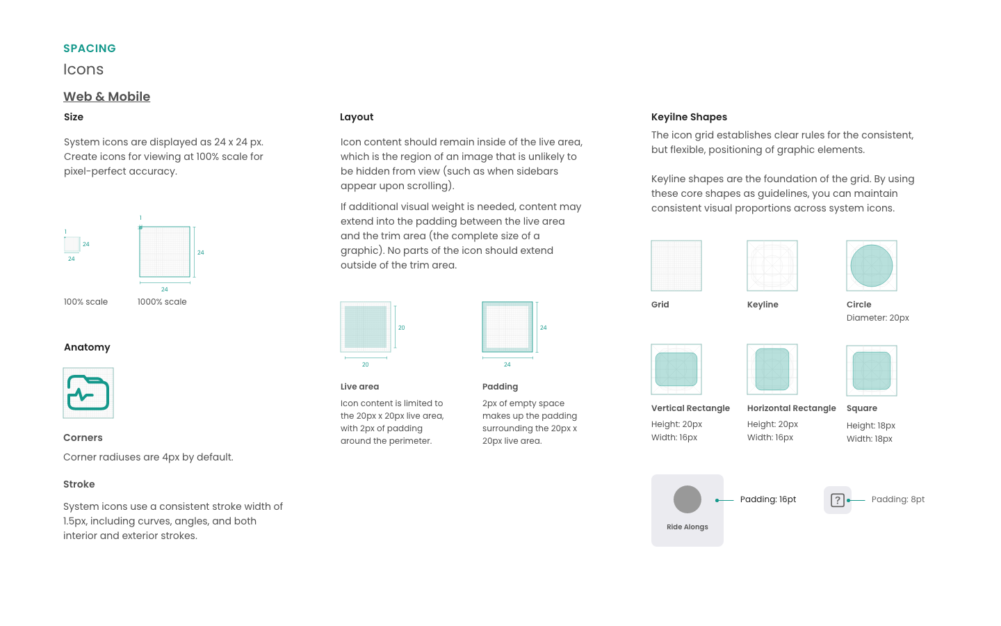
1. Foundations - Typography, Color, Spacing, Grid, Elevation, Motion
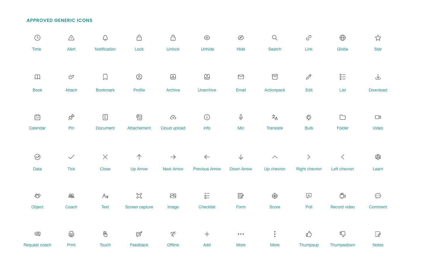
2. Components - Buttons, Inputs, Modals, Tables, Tabs, Toasts, etc.
3. Patterns - Form validation, Empty states, Error handling, Navigation
4. Tokens - Used Design Tokens (e.g. spacing-4, primary-500) to align design and code.
Building the System
- Design: Created master components using auto layout, variants, and component properties.
- Documentation: Used Zeroheight to document usage guidelines, do’s & don'ts.
- Engineering: Paired with devs to build React components in Storybook.
- Testing: Visual regression tests using Chromatic; accessibility testing (WCAG 2.1 AA).
Adoption & Rollout
- Created a pilot team to implement the system on a new module.
- Conducted internal workshops to onboard design + dev teams.
- Set up governance with contribution model
Impact
- Reduced UI inconsistencies by 80% in 3 months.
- Cut design-to-dev handoff time by 40%.
- Reduced bug reports related to UI mismatches.
- Improved team morale and confidence in delivering quality UX faster.
